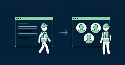
Where to Place Gobi on Your Website

You have collected employee stories, edited them in Studio and grabbed the embed code. Now comes the part that matters most: where you put them.
Gobi Stories is a Norwegian video platform that helps businesses collect and publish authentic employee stories — and the placement of the widget is one of the most important factors for results. Wrong placement means visitors never discover them. Right placement means they stop, click and spend more time on your page.
Why placement determines conversion
The logic is simple: the higher up on the page the video appears, the more people see it. The more people watch, the longer the average time on page. And longer time on page signals to Google that the content is valuable — which directly affects your SEO ranking.
It is a positive spiral: higher placement → better conversion → more views → longer time on page → better SEO.
Yet surprisingly many businesses place their videos at the bottom of the page — after all other content — where only a fraction of visitors ever scroll. It is like placing your best product at the back of the store with no signage.
Where to place the Gobi widget
Above the fold — or right below
Place the video so visitors see it without scrolling far. That means either in the hero section or immediately below it. The rule is simple: the widget should be visible within one screen length of the page loading.
Many websites have a hero with a heading and introduction, followed by a section with a value proposition. The Gobi widget should sit here — in the second or third section from the top — not as item number eight on a long scrollable page.
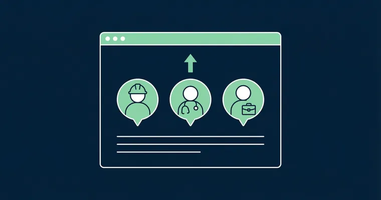
On the right pages
Not all pages are equally valuable for video. Prioritise the pages with the highest traffic and where visitors make decisions:
- Homepage — gives immediate credibility and shows who you are
- Career page — the most valuable placement for recruitment (read our career page placement guide)
- About us page — visitors who click here are already curious — give them a face
- Product pages — customer stories in video format build trust faster than text
- Landing pages — tailored content for campaigns and advertising
Size and visual hierarchy
Give the widget space
A Gobi widget squeezed into a narrow column or hidden in a sidebar communicates that the video content is secondary. That is the opposite of what you want.
Give the widget full width or place it as a central element in the section. The stories display as circular bubbles — and they need breathing room to look inviting. Show 4–6 story bubbles across on desktop and let them scroll horizontally on mobile.
Visual hierarchy
The widget should have equally prominent placement as the most important content elements on the page. It should not compete with a CTA button, but rather support it.
A good pattern:
- Heading — clear and concise
- Gobi widget — shows employee stories visually
- CTA — action button that builds on what the visitor just saw
When the widget sits between a heading that sets context and an action button that provides direction, you have built a small conversion flow where the video does the heavy lifting.
The text around the widget
The heading above the widget
The text above the Gobi widget should tell visitors what they are about to see — and give them a reason to click. Avoid generic headings like “Videos” or “See our stories”. Be specific.
Good examples:
- “Meet the people behind” — personal and curiosity-inducing
- “This is what a typical day looks like” — answers the question visitors are asking
- “Hear it from the people who work here” — third-party credibility
- “See what our customers say” — for customer stories
Poor examples:
- “Videos” — says nothing
- “Gobi Stories” — product name, not user value
- “Media content” — corporate and lifeless
Text size and style
The heading above the widget should have the same typographic weight as other section headings on the page — typically an H2 or H3. It should not look like a footnote. Consider adding a subtitle or a short paragraph below the heading:
Meet the team Employees share in their own words what it is like working here.
Short, specific and it sets the expectation for the content that follows.
Mobile matters just as much
More than half of web traffic comes from mobile — and for recruitment pages the share is even higher. Gobi Player is built for mobile with vertical 9:16 format, but the placement on the mobile version of the page is just as important as on desktop.
Check that:
- The widget is visible early in the scroll on mobile — not pushed down by elements that take more space on a narrow screen
- The story bubbles are large enough to attract a tap — bubbles that are too small get ignored
- There is enough breathing room around the widget so it does not blend into surrounding content
A checklist for optimal placement
- Position: Within one screen length from the top — never at the bottom
- Size: Full width or central element — never squeezed into a sidebar
- Heading: Specific and action-oriented — not generic
- Text size: Same weight as other section headings (H2/H3)
- Hierarchy: Heading → Widget → CTA — a natural conversion flow
- Mobile: Check that the widget is visible early and bubbles are large enough
- Update regularly: Old stories with employees who have left send the wrong signal
Placement is not a one-time task — it is worth experimenting and looking at the numbers. Gobi Analytics shows you how many people click, watch to the end and interact with the stories. Use the data to optimise over time.
Wondering if the Gobi widget affects loading time? Read our guide on Gobi and loading time.
Ready to optimise your placement? Log in to Gobi Studio and adjust the setup, or read how to embed Gobi stories for the first time.