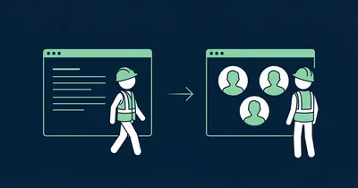
Gobi Placement on Your Career Page

Candidates do not read career pages. They scan them — in under 60 seconds. They are not looking for well-crafted paragraphs about “collaboration, innovation and employee-driven values”. They are looking for one answer: What is it actually like to work here?
Text cannot answer that credibly. Video can. But only if the candidate actually sees it.
Gobi Stories is a Norwegian video platform that makes it easy to collect and publish authentic employee stories. This guide is about where to place the widget on your career page — because that is the difference between a video everyone sees and a video no one finds.
Candidates want to watch, not read
There is a reason vertical 9:16 video dominates how we consume content. It is fast, it is real and it requires zero effort from the viewer. Candidates on your career page behave exactly as they do on social media: they scroll fast, stop at faces and movement, and ignore blocks of text.
That means your career page should be built around the format candidates actually engage with. Not around three paragraphs about company culture that the communications department wrote in 2022.
Where on the career page to place Gobi
Right below the hero section
Career pages typically have a hero — a large image or banner with a heading and introduction. That is the first thing the candidate sees. The second thing they see should be employee videos.
Not after three sections of text. Not after a list of benefits. Not after a grid of logos. Right below the hero, as the first interactive element on the page.
The candidate has just landed. They are curious. Give them what they actually want: real people talking about what it is like to work at your company.
Above the job listings
Many career pages have a section with current openings. Place the Gobi widget above this list — not below it. Candidates who have watched an employee story before browsing through the positions apply with an entirely different motivation. They already have a sense of who you are.
Never on a subpage
Do not hide the video on an “About us” subpage, a “Culture” tab or a “Life at” section that requires an extra click. Candidates will not find it — and you lose the conversion.
The video should live on the main career page. It should be impossible to miss.
The text that frames the widget
The text around the Gobi widget on the career page has one job: make the candidate want to press play. Speak directly to them.
Headlines that land
Candidates do not care about your company. They care about themselves — and about finding a place where they fit in. The heading should mirror that.
Works:
- “Meet the people who work here” — simple, direct, a promise of real people
- “This is what a typical day looks like” — answers what candidates wonder most
- “Find out if you belong” — appeals to self-identification
Does not work:
- “Our values in practice” — corporate, no pull
- “Employee videos” — descriptive but not engaging
- “View our media library” — like inviting someone on a date with the words “see my CV”
Subtext
A short line below the heading sets the expectation:
Hear from the people who actually work here — in their own words, in under a minute.
That is enough. Do not explain what Gobi is, do not write three paragraphs about authenticity. Just set the scene and let the video do the work.
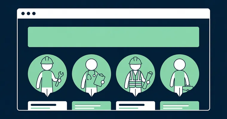
Size and visual hierarchy
The widget is the main content
On a career page, employee videos are the most important content you have. Treat them that way. Give the widget full width and plenty of space. Make the story bubbles large enough that faces are clearly visible — it is the faces that stop the scroll.
A common mistake is placing the widget in a narrow column next to text. That signals the video is secondary. On a career page, it is primary.
Hierarchy that converts
The most effective layout:
- Heading — “Meet the team” or similar
- Gobi widget — employee stories, fully visible
- CTA — “See open positions” or “Apply now”
This order is not random. The heading sets context. The video builds the feeling. The CTA captures the motivation while it is fresh.
“With Gobi, we can present who we are and what we do in a low-key and authentic way. We can produce far more in less time, without needing a professional camera or multiple rounds in expensive editing tools.”
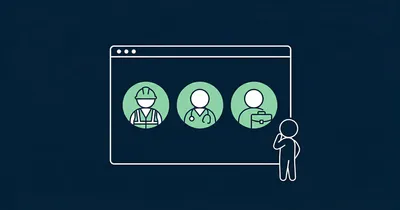
Multiple teams? Use multiple widgets
If you recruit for different departments, consider having one widget per team — each with stories from the employees in that specific team. Candidates interested in a developer role want to see developers. Candidates considering a sales role want to see salespeople.
Place team-specific widgets near the relevant job categories. One large, general widget at the top of the page and team-specific widgets near the openings — that is the setup that delivers the best conversion.
Checklist for the career page
- Placement: Right below the hero — the first interactive element
- Never on subpages: The video should live on the main career page
- Above the job listings: Candidates who have watched video apply with stronger motivation
- Full width: The widget is main content, not sidebar filler
- Heading: Speak to the candidate — “Meet the people who work here”, not “Employee videos”
- Hierarchy: Heading → Widget → CTA
- Mobile: Check that bubbles are large enough and visible early in the scroll
- Update regularly: Employee stories from 2022 send the wrong signal
Good placement is also part of a better candidate experience with video. Want to learn more about which videos work best on the career page? Read our complete guide to career pages with video. For general website placement, see where to place Gobi on your website.